What was Peak Fantasy UI?
February 21, 2025
For a new project, I've been studying the UI of every current fantasy platform (web and mobile app). Thanks to the Internet Archive, I can also study the UIs of what has come before.
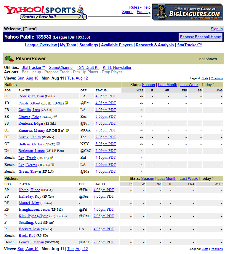
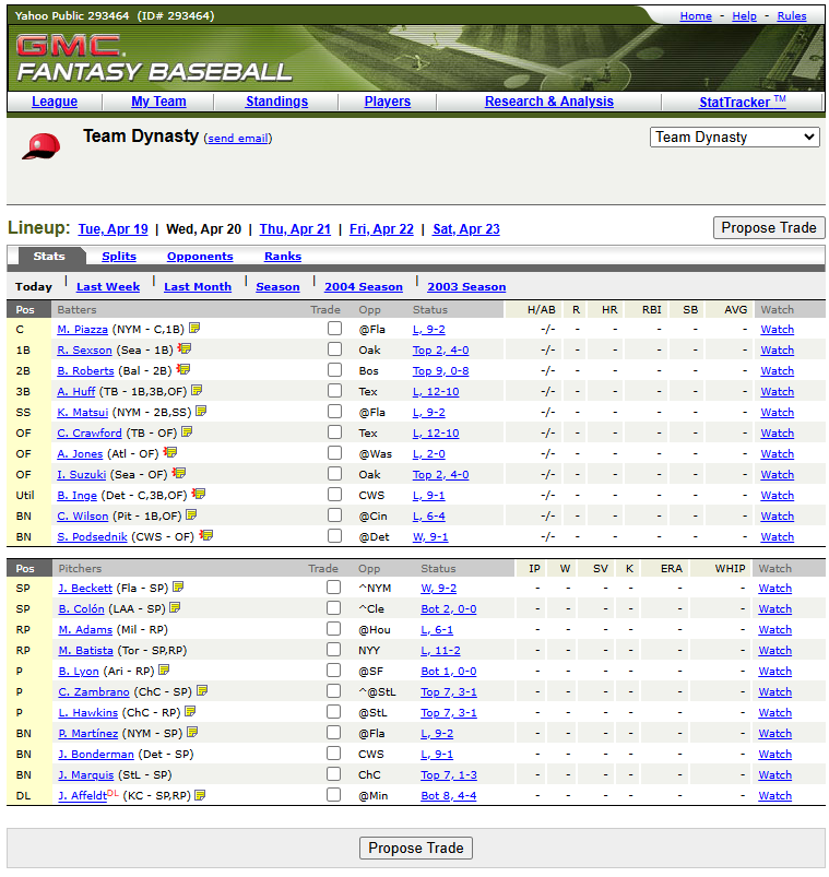
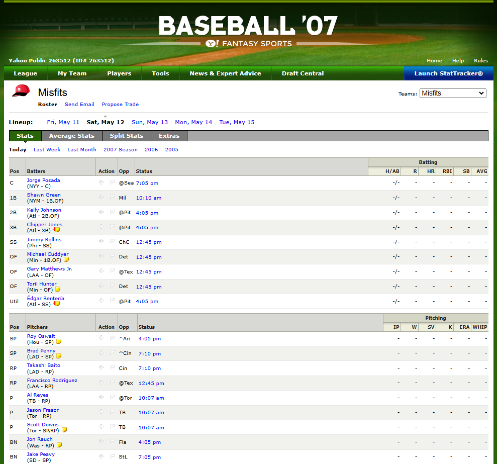
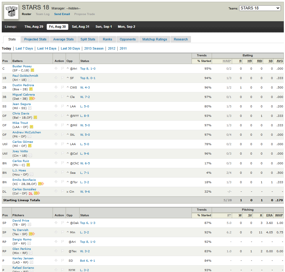
Yahoo has been fairly well-preserved in the Internet Archive, thanks to their leaderboards with scrapable-links to their public leagues.
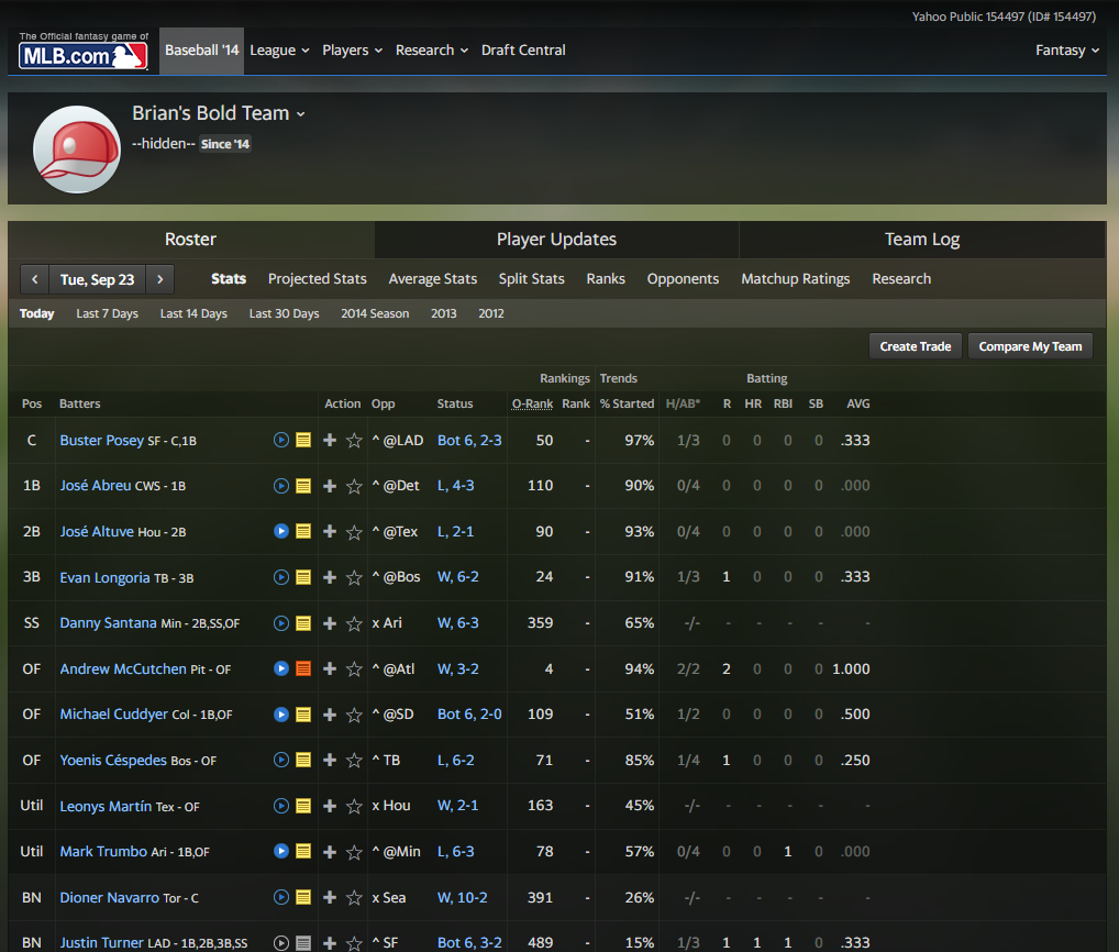
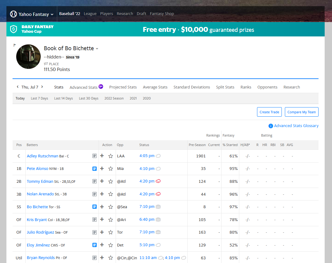
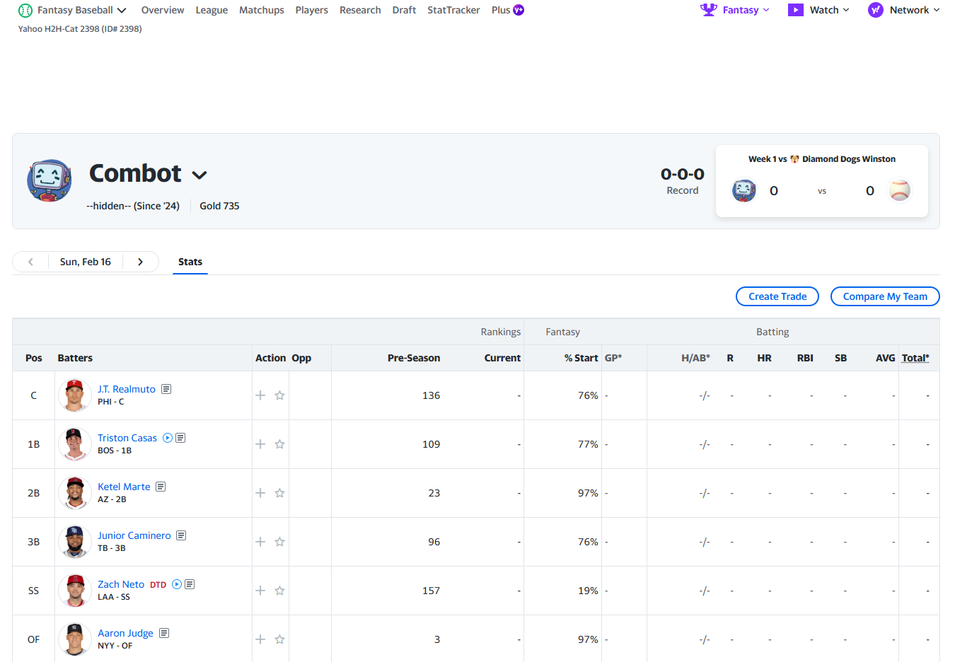
- They started off with a serif font for the roster table, but it's been sans-serif everywhere for a long time. (Ottoneu, with a monospaced font, is the exception.)
- I miss the little yellow sticky note icon for player news. But I guess the yellow became a bit much when there was news for every player every day.
- Notice how the layout keeps expanding so that less and less is visible above the fold.
- That 2014 dark theme was truly ahead of its time. I'm pretty sure they added the light theme back when people threw a fit.